
Enhance Your Site
Your site has officially launched — now what? Use these helpful tips and principles to continue evolving and making the most of your NC State web properties.
Our Best Practices
Effective communication goes beyond just the words on a page. It also includes how you lay out and design your content. People have limited attention when browsing the web, and the difference between a good site and a bad site can mean losing a valued user.
The NC State Web Platform offers a wide variety of blocks designed to make your content as eye-catching, digestible and unique as possible. Below, you’ll find some basic principles to level-up a webpage’s look and feel — and motivate your users to keep exploring your website.
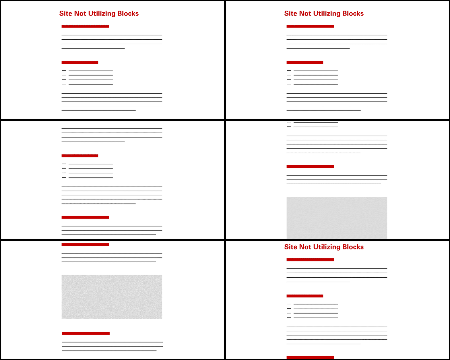
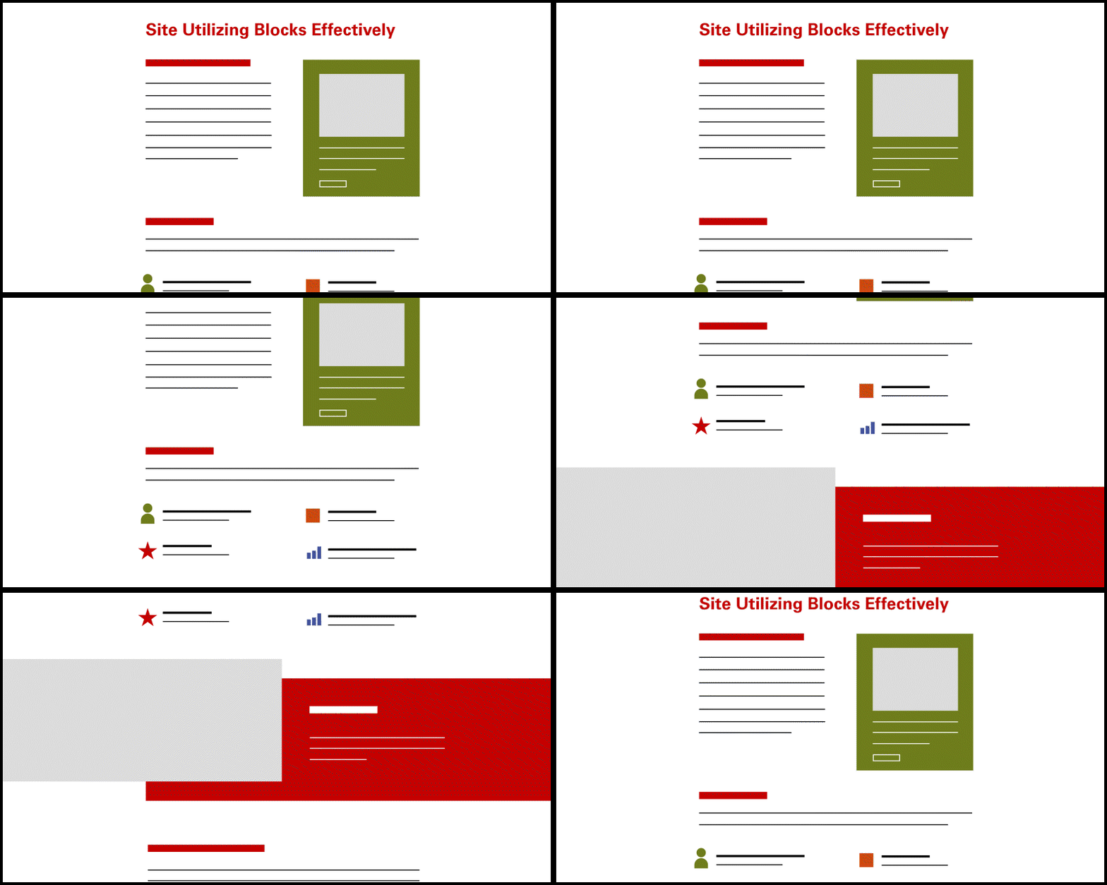
1. Show Hierarchy
Using a variety of fields of color, different typefaces and heading sizes helps orient a reader through a page. When you want to emphasize an idea, link or action your user will care about, pick a block that stands out to guide them there.
(Another important tip: Different headings sizes aren’t just there for decoration. Use heading levels correctly so search engines and screen readers can understand your content.)
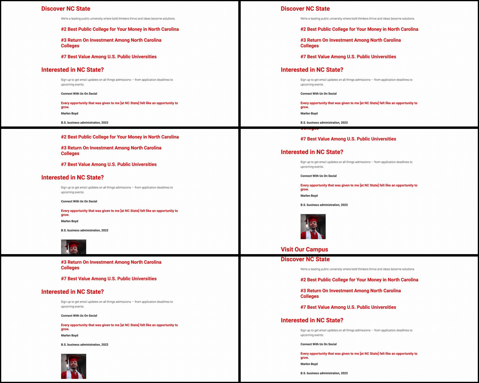
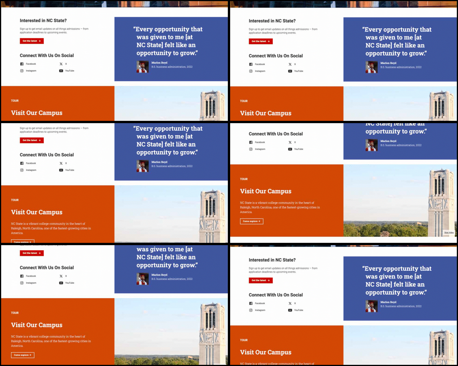
2. Break Things Up
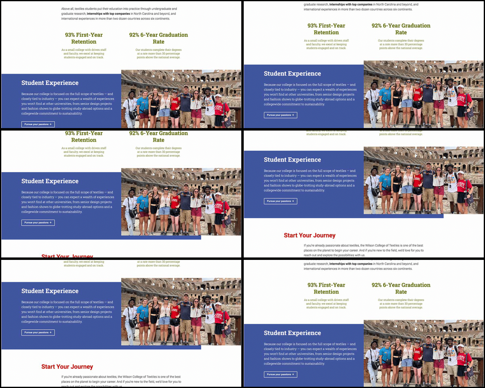
We can help users quickly understand our content by “chunking” it into logical sections. Visual ways to break up content using blocks of color and full-width elements can help make the pacing of a page feel natural and intriguing.

3. Keep the Eye Moving
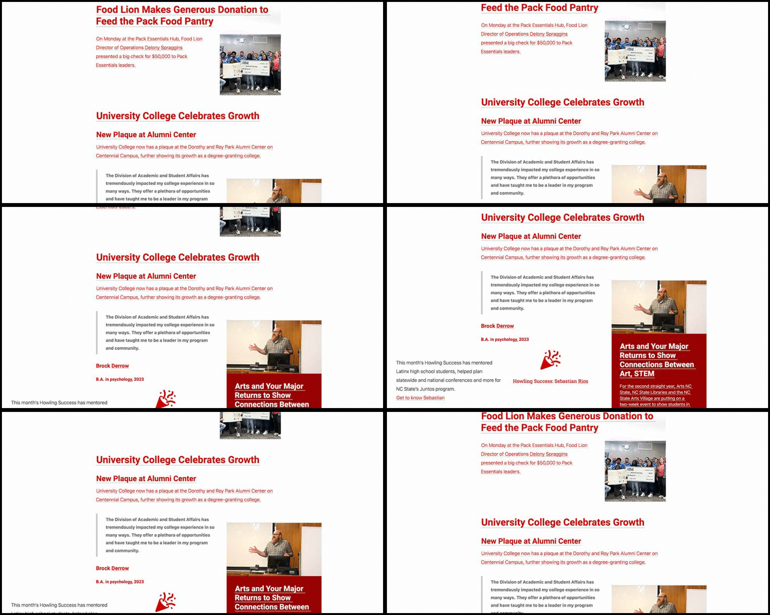
There are many blocks that can be used to alternate the alignment of content. When put together, these create a visually interesting layout that engages the viewer. Adding floating elements can also help to break things up and guide the user’s eye down the page.

4. Balance Copy and Visuals
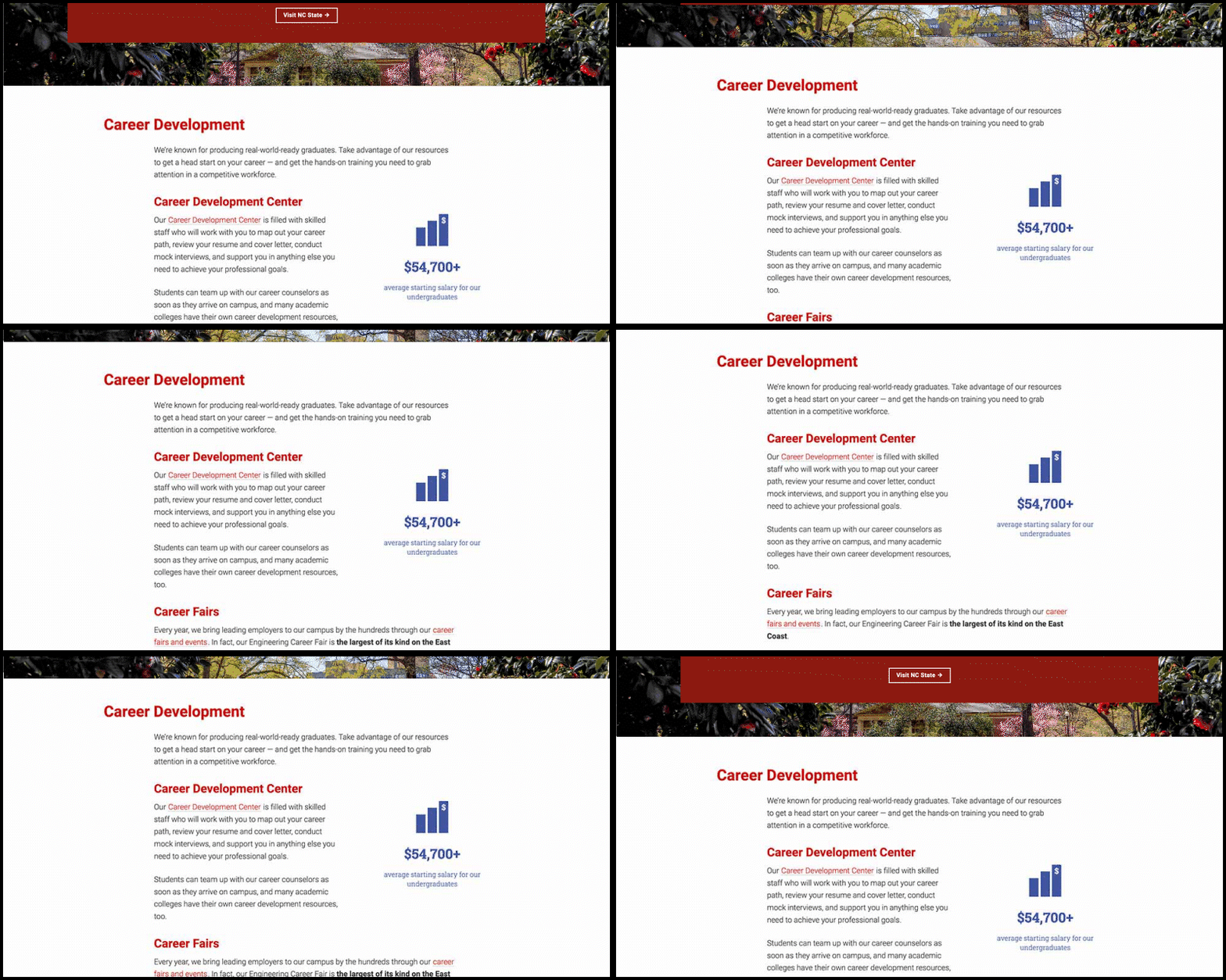
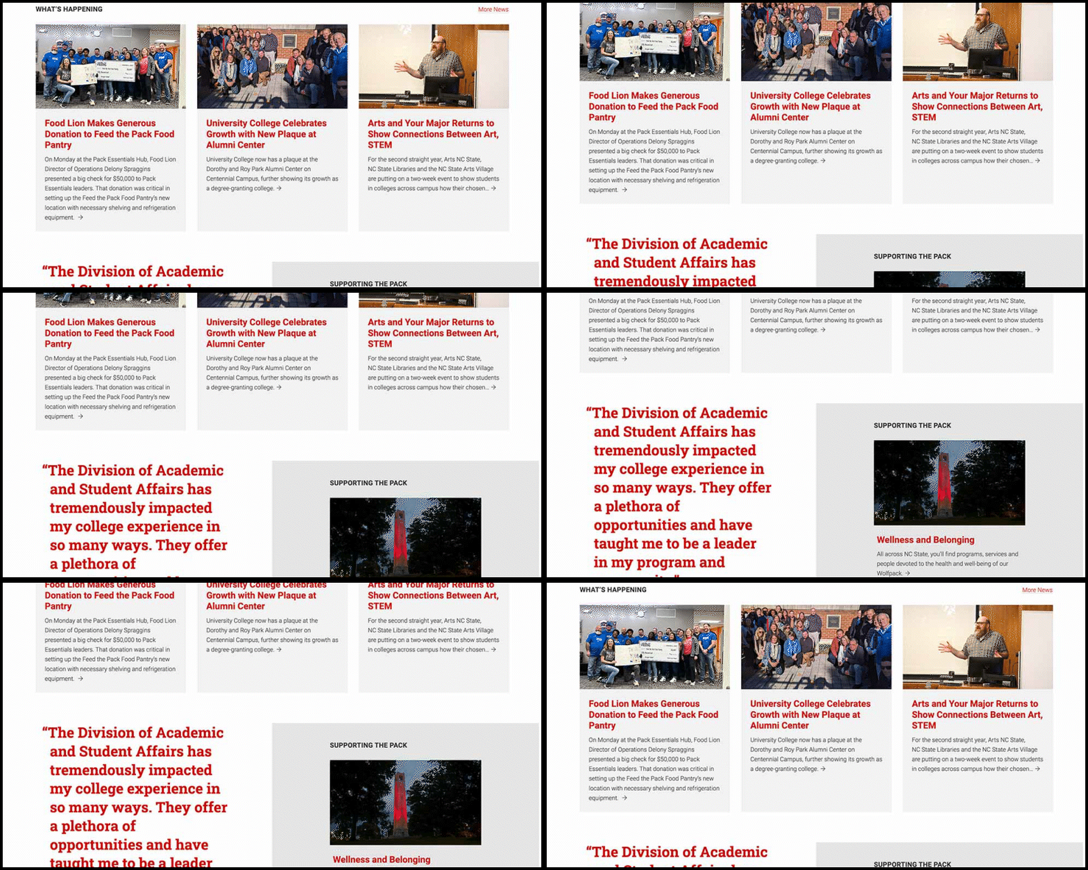
The user’s eye still needs a break. When everything is emphasized, nothing is emphasized. As tempting as it may be to minimize copy and use blocks to enhance visuals, the content must still be key. Likewise, emphasizing all text in the same way is overwhelming.
Visit the Inspiration Gallery