Page Header Options
A look at the various header options available for pages.
A header is essential on every page. It gives users a starting point for viewing content and is typically the first thing a screen reader picks up when scanning a page.
Each header serves as the page title, which starts the heading hierarchy that structures a site. In HTML, the page title is heading level one, or “H1.” All following headings build out that hierarchy.
For more on heading hierarchy, an important part of digital accessibility, see the Heading Block documentation.
Change the Header
The NC State Theme offers three header options: Default, Split and Floating Box. The appropriate header depends on what area of the site you’re editing.
To change the header layout, select the parent header area block (hover over the current header block’s icon for easy selection) and click on the paintbrush icon. This opens a menu of available header layout options.
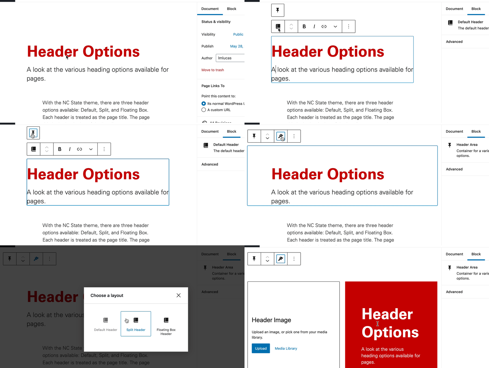
Available Settings
Table of Contents
All three header options allow you to toggle on a Table of Contents to increase the navigability of lengthy pages by creating an organized list of anchor links. This page currently uses the Table of Contents feature.
Default Header
Of the three header types, the Default will likely be the most frequently used. Most subpages will want to use the Default header, since it will in many cases be linked to from a homepage or top-level landing page using the Split or Floating Box header. The Default is the most straightforward, since it only allows for adjusting the header text and providing a subtitle.
See an example of the Default Header below.

Split Header
The Split Header includes an image alongside a content box with a heading, subtitle and the option to add a call to action button that links to another page. It is best used on homepages or top-level landing pages of specific menus. This header is visually eye-catching and a great way to leverage stunning photography that can lead users to explore a site further.
See an example of the Split Header below.

Split Header Settings
To see the available settings, click on the Settings menu next to the blue Save button, then click on the content box. Available settings include:
- Focal point picker
- Select which part of the image is central for different screen sizes
- Content box settings
- Toggle on the CTA (call to action) to add a button. Toggle off to remove it
- Change the location of the box (left or right)
- Color settings
- Change the background color of the content box
Floating Box Header
The Floating Box Header, available only in the Pro and Premium tiers of the NC State Web Platform, includes a content box over a full-width image that features a heading, subtitle and the option to add a call to action button that links to another page. It also supports a silent, looping moving media file in place of a static image; specifications are below. It is best used on homepages or top-level landing pages of specific menus. This header is visually eye-catching and a great way to leverage stunning photography or video that can lead users to explore a site further.
See an example of the Floating Box Header below.

Floating Box Header Settings
To see the available settings, click on the Settings menu next to the blue Save button, then click on the content box. Available settings include:
- Focal point picker
- Select which part of the image is central for different screen sizes
- Moving media file
- Gives you the option to upload a silent, looping video
- Video specifications/requirements:
- Video length: 10 seconds or less
- Video size: 1500 x 643 pixels
- File type: MP4, without audio
- File size: 5 MB or less
- Upload an image as a backup in case of a weak network connection or if the page is viewed on a mobile device.
- Each website is limited to one moving media file.
- Content box settings
- Toggle on the CTA (call to action) to add a button. Toggle off to remove it
- Change the location of the box (left or right)
- Color settings
- Change the background color of the content box