Color Palette Overrides
One of the biggest features of the unbranded version of the NC State Theme is the ability to change the color scheme used on the site.
A high level of override granularity can be achieved, but this level of control is usually unnecessary for most sites. This level of control also benefits from a more detailed understanding of how the theme’s styling is architected. If you have any questions about implementing color overrides, please reach out to us.
Most sites will only need to override the “Brand Primary” and “Brand Secondary” variables.
Brand Primary
This is the core color of the theme, by default this controls the colors of things like Headings, backgrounds, and links.
Default: #CC0000
Override Tag: brand-primary
Brand Primary Dark
This is the darkened version of brand primary, it is used by most hover states and in a few other places that a darker version is needed for accessibility.
Default: #990000
Override Tag: brand-primary-dark
Dark Heading text
This is the color of the headings, in the base theme this will default to brand-primary, but due to accessibility if your primary color is too light you may need to override this.
Default: brand-primary
Override Tag: dark-heading-text-color
Text has Background
This is the color of the text when a background other than white is assumed to be present. In the event your backgrounds are of a lighter color this may need to be overridden for accessibility.
Default: #FFFFFF (white)
Override Tag: text-has-bg-color
List Bullet
This is the color of the bullets in lists, it will default to the brand primary but if your brand primary is too light you may need to override.
Default: brand-primary
Override Tag: list-bullet
Content Card Header
This is the color for the headline in the card of the Featured Content block.
Default: brand-primary
Override Tag: content-card-header
Content Card Teaser
This is the color for the teaser in the card of the Featured Content block.
Default: #333333 (dark-grey)
Override Tag: content-card-teaser
Content Card CTA
This is the color for the call to action in the card of the Featured Content block.
Default: brand-primary
Override Tag: content-card-cta
Video Image Play indicator
This is the color for the youtube play icon of the Video Image block.
Default: brand-primary
Override Tag: video-img-play-indicator
Video Image Play hover
This is the color for hover state of the youtube play icon in the Video Image block.
Default: brand-primary-dark
Override Tag: video-img-play-hover
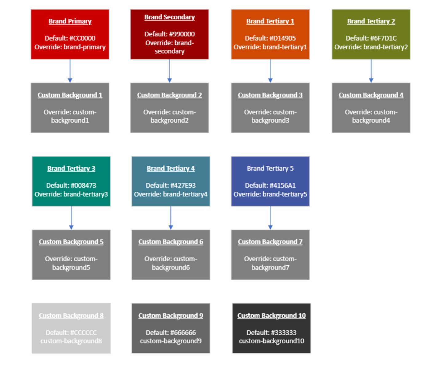
Background Colors
These are the colors that are used by dynamic background colors of most blocks within the theme. For most they can be overridden in two ways either the brand color or the custom background color, for background colors that use a brand color they will always default to the brand color unless the custom background color is set in the overrides section. For defaults and overrides see the figure below.
Default: Varies based on the background, the first seven are the brand primary, secondary, and tertiary colors, with the last three being set to shades of grey.
Override: custom-background# (# corresponding to the order of the backgrounds in the selector)
Background Hover/Active Colors
Additionally Background colors have a related -active override to assign darker or lighter colors for on hover/focus states.
Default: Varies, the first seven are darkened versions of the default brand primary, secondary, and tertiary colors, with the last three being set to shades of grey.
Override: custom-background#-active (# corresponding to the order of the backgrounds in the selector)