Button Block
Use Cases
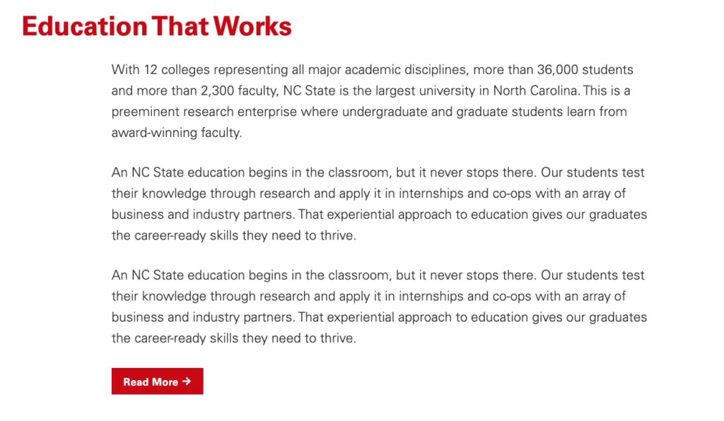
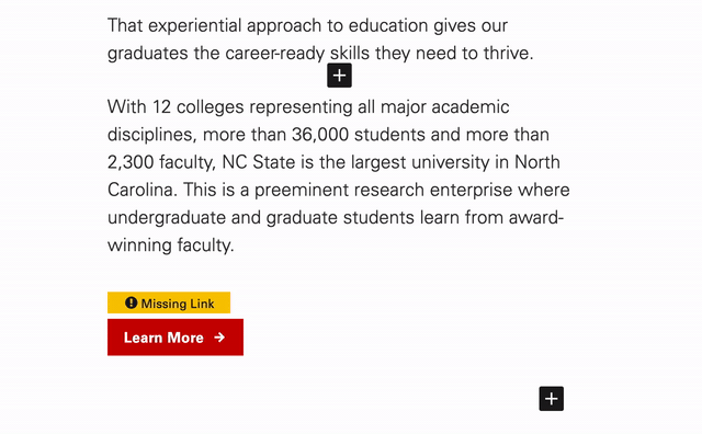
The Buttons block is a nice way to include styled hyperlinks on a page or post. Effective in grabbing a reader’s attention at the end of paragraph or story, the Buttons block can be a good way to prompt users to dig deeper into a site and explore other relevant content. That said, it is important to be mindful of the placement of a Buttons block, as readers will typically expect to find them at the end of a thought. Placement elsewhere, such as the beginning or middle of a paragraph, can oftentimes come off as irregular to a user. See an example of the Buttons block below.
Features
To add a button, click the “Add a block” button and choosing “Buttons” from the block list. Alternatively, the block can be found by using the “Search for a block” function. For more info on blocks and adding them to a WordPress site, see our documentation on blocks.
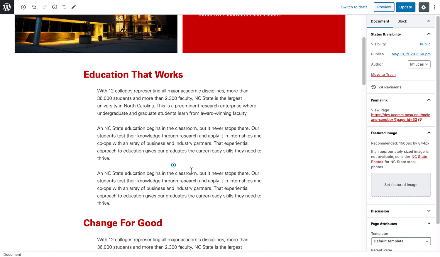
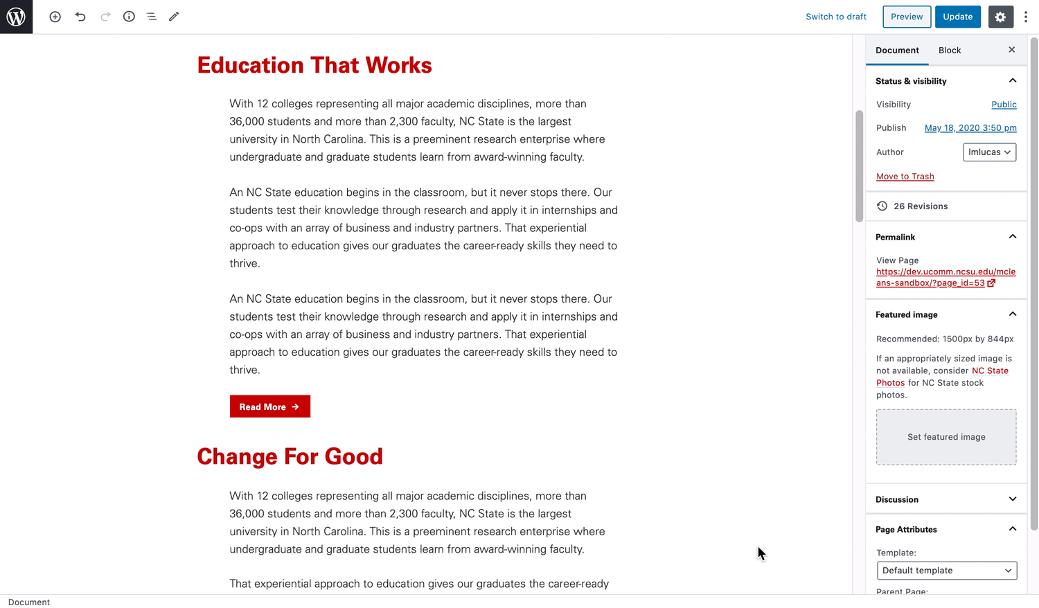
Once added, the Buttons block is easy to setup. Creators will simply need to provide a link and call to action.
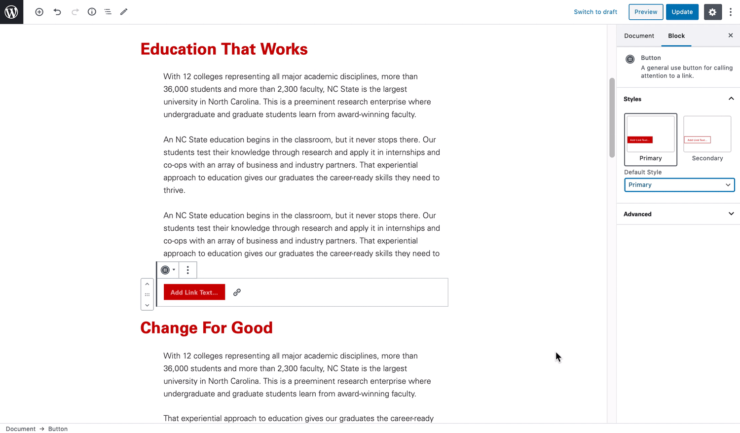
Additional customization is also available through the block settings found on the right-hand side menu where the style of the block can be change.
Additional Functionalities
In some cases, the styling of the Buttons block is context-aware. For example, when a YouTube link is placed in the Buttons block’s URL field, it will stylize the button to display a “play” icon. This helps communicate to visitors of your site that the button leads to a video.
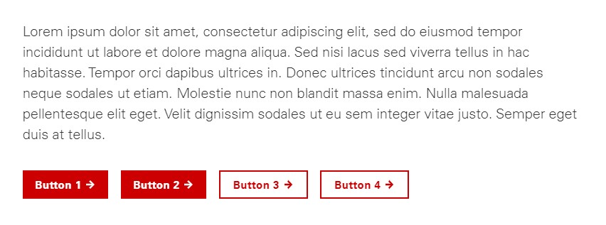
In a recent update of the Buttons block, it also now possible to add multiple buttons within a single block. This update also supports alternative stylings across each specific button (see example below).
Need help?
Have questions? Feel free to reach out with any questions or concerns at go.ncsu.edu/ucomm-dev-request.