Scrolling Spotlight Block
The Scrolling Spotlight block shows a large photo that fills the screen and stays in place while a series of short statements scrolls up over it. Use it to walk visitors through a few key messages, one at a time, against a single memorable image.
It’s a storytelling block for marketing pages: homepages, admissions and recruitment pages, campaign and program landing pages. On those pages, your goal is to make an impression and move visitors toward an action. It’s less suited to informational pages, where visitors want to find an answer quickly.
When to use it
Use the Scrolling Spotlight block when you want to:
- Tell a short story in steps. For example, a department homepage that introduces “Our Research,” “Our Students” and “Our Impact” over a photo of your building, with a button under each one.
- Give a set of related links a big visual moment. For example, an admissions page that leads visitors to “Majors and Careers,” “Admissions and Aid” and “Campus Life” over an aerial photo of campus.
Using it strategically
- Know who the page is for. Build your statements around what that audience cares about. For a prospective student, that might be “What will I study?”, “Can I afford it?” and “Will I fit in?”
- Tell a story in order. Statements appear one at a time, so arrange them like a short narrative: a big idea first, then supporting points, then what to do next.
- Give every statement a next step. Each button should lead somewhere useful, such as a program page, an application or a visit sign-up. A statement without a clear next step is a good candidate to cut.
- Save it for your key message. This block takes up a lot of space and asks visitors to scroll through it. Use it once on a page, for the messages you most want visitors to remember. Surround it with regular content, so the page has a rhythm of big moments and quick reading.
- Choose a photo that says “NC State.” One image sits behind every statement, so pick one that sets the tone for all of them: a recognizable campus scene, or people doing the work you’re describing.
Choosing between Spotlight and Scrolling Spotlight
The Advanced Feature Pack has two photo blocks with similar names: the Spotlight block and the Scrolling Spotlight block. Pick the one that fits what you’re promoting.
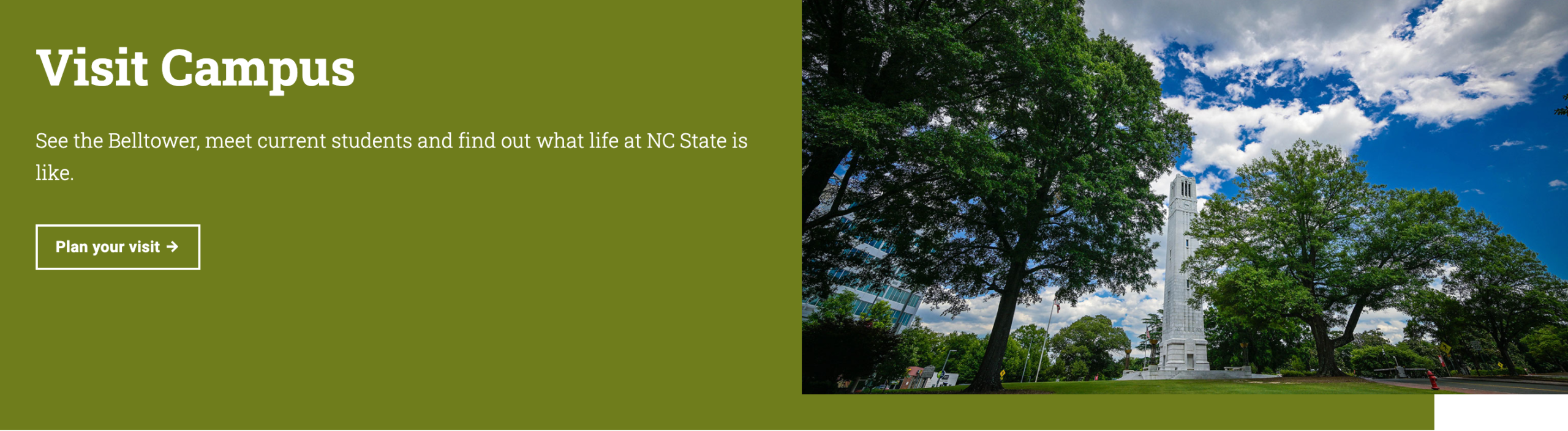
Spotlight pairs one message with a photo beside it:
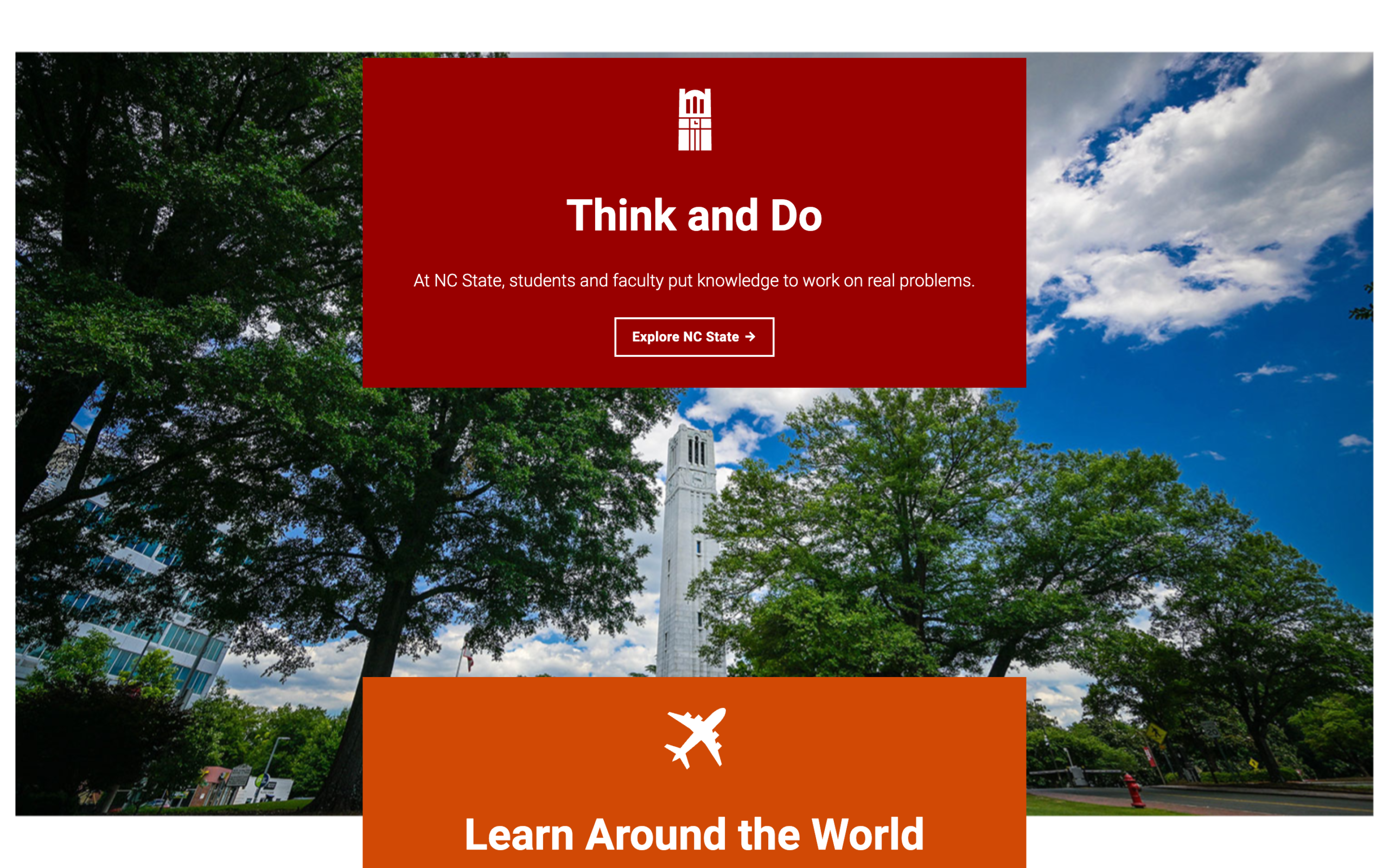
Scrolling Spotlight places several messages over one large photo, one after another:
| Spotlight block | Scrolling Spotlight block | |
|---|---|---|
| Best for | Promoting one page or story | Sharing several messages in a row |
| Messages | One heading, teaser and button | As many statements as you add, each with its own heading, teaser, button and icon |
| Image | Sits beside the text | Fills the screen behind the text and stays in place as visitors scroll |
| Layout options | Mirror Layout puts the image on the left or right | Statements always appear in a column in the middle of the image |
If you only have one message, the Spotlight block is simpler and takes up less room. To highlight one link with an icon instead of a photo, use the Button Spotlight block.
Before you start
The Scrolling Spotlight block is part of the Advanced Feature Pack and needs the NC State Pro Add-on. If you can’t find it in the editor, ask your site administrator to turn it on under NC State Settings -> Feature Packs.
Starting with version 4.19 of the NC State Theme, site administrators can require the Advanced on-demand training before you can add this pack’s blocks. See all On Demand Trainings.
You can add the block to pages, not posts.
You’ll also need:
- A wide, landscape photo. The block suggests an image of 1470px x 850px. Pick a photo without important details near the edges, since the edges may be cut off on some screens. For more about image sizes, see Image Format, File Name and Size.
- Alt text for the photo, added in the Media Library before you choose it (see Adding alt text).
- Your statements written out. Each one has a heading, a short teaser and an optional button. Short statements work best.
Adding the block
- In the page editor, click the + (Add block) button.
- Search for Scrolling Spotlight.
- Click the block to add it to your page.
- In the Background Image box, upload a photo or choose one from your Media Library.
- The block adds your first statement for you. Click Click to add heading and Click to add teaser to type your text.
- To add another statement, click the + button below the last statement.
- Open the Settings panel in the right sidebar to change the image, the icons and the colors.
In the editor, the image and statements are shown one after the other. Preview the page to see the image stay in place while the statements scroll over it.
What visitors see
On larger screens such as laptops and desktop monitors:
- The photo fills the width of the page and the height of the screen.
- As visitors scroll, the photo stays in place and your statements move up over it, one after another, in a column in the middle.
- When they scroll past the last statement, the photo scrolls away with the rest of the block.
On phones and other small screens, the photo appears at the top as a regular image, with the statements stacked below it.

Settings
The Scrolling Spotlight block has two layers of settings: settings for the whole block (the image and icon style), and settings for each statement. Click the photo or the area around the statements to see the block settings. Click inside a statement to see its settings.
Tip: Statements can be hard to click in the editor. Open the Document Overview (the button with three stacked lines at the top of the editor) to see every statement in a list, and click one to select it.
Block settings
| Setting | What it does |
|---|---|
| Use Outline Icons (in Icon Settings) | Switches the icons in every statement to an outline style. It’s off by default, so icons are filled in. |
| Image File: (in Image Settings) | Shows the photo you chose. Click it to pick a different one. |
| Focal Point Picker: (in Image Settings) | “Select the part of the image to maintain focus on throughout different screen sizes.” Click the most important part of the photo, such as a person’s face or a landmark, so it stays in view when the photo is cropped. |
Statement settings
Each statement is a Split Statement block inside the Scrolling Spotlight. Click inside a statement to see these settings.
| Setting | What it does |
|---|---|
| Use Background Color (in Settings) | Off by default, which puts your text in a white box. Turn this on for every statement. The text changes to white. |
| Background Color (in Background Color Settings) | Appears when Use Background Color is on. Choose one of your site’s secondary brand colors for the box. |
| Include Fact Icon (in Settings) | On by default. Shows an icon above the heading. Turn it off for a text-only statement. |
| Icon picker (in Content Settings) | Appears when Include Fact Icon is on. Click – Select Icon – (or Edit Icon once you’ve picked one) to open the Select an Icon window, then click an icon. If you don’t pick one, no icon appears on the live page. |
Each statement also has its own text settings:
| Setting | What it does |
|---|---|
| Heading (Click to add heading) | The statement’s heading. You can make words italic. |
| Teaser (Click to add teaser) | A sentence or two under the heading. You can make words bold or italic. |
| Use CTA (in Layout Settings) | On by default. Shows a button under the teaser. Turn it off if the statement doesn’t need a link. |
The button works like any other button on your site. See the Buttons block article for how to set the text and link.
Example: A college homepage uses an aerial photo of campus with the focal point set on the Memorial Belltower. It has three statements, each with a background color and an icon:
- “Majors and Careers,” with a briefcase icon and a button that reads “See what’s possible”
- “Admissions and Aid,” with a handshake icon and a button that reads “Start your journey here”
- “Campus Life,” with a belltower icon and a button that reads “Find your community”
Accessibility
Adding alt text to the image
Visitors who use screen readers hear the photo’s alt text, so describe what’s in the photo. For example: “An aerial view of NC State’s main campus, including the Memorial Belltower.”
The block uses the alt text that’s saved with the photo in your Media Library when you choose it. There isn’t a separate alt text field in the block. If you choose a photo that has no alt text, the block shows a warning in the Image Settings panel.
To add or fix alt text:
- Go to Media -> Library and click the photo.
- Type a description in the Alternative Text field. Changes save automatically.
- Go back to your page, click the photo under Image File: and choose the photo again.
For help writing good alt text, see Alt Text.
Keeping text readable
- Use a secondary brand color, not the white box. Turn on Use Background Color for each statement and choose one of your site’s secondary brand colors. The text turns white, so pick a color dark enough for white text to be easy to read.
- Keep the photo behind the boxes, not the words. Your text always sits in a box, so it doesn’t sit directly on the photo. That keeps it readable no matter what the photo looks like.
Motion
The block doesn’t play any animation. The statements move only when visitors scroll, and the photo stays still. On phones and small screens, there’s no scrolling effect at all.
Headings
Each statement heading is a main section heading on the page (level 2). Write each one so it makes sense on its own, and don’t leave any headings blank.
Tips
- Keep it to a few statements. Three to six short statements are easier to scroll through than a long list. Each statement adds a lot of scrolling.
- Use one photo that works for every message. The same photo stays behind all your statements, so pick one that fits the whole story.
- Set the focal point. Screens come in many shapes, so part of your photo will be cut off. The focal point keeps the most important part in view.
- Write short teasers. Visitors are scrolling past, so a sentence or two works better than a paragraph. Use the button to link to the full story.
- Give the block some breathing room. Because it fills the screen, it works best with regular content above and below it rather than next to other large image blocks.
Frequently asked questions
Why doesn’t the photo stay in place in the editor?
The editor shows the photo and statements one after the other so they’re easier to edit. Preview or view the live page to see the scrolling effect.
Why doesn’t the icon show on my live page?
Include Fact Icon is on, but no icon has been picked. Click the statement, open Content Settings and choose an icon, or turn Include Fact Icon off.
Can I add links in the teaser text?
No. The teaser supports bold and italic text only. Use the statement’s button to link to another page.
Can I use a different photo for each statement?
No. The whole block uses one photo. If you need a different image for each message, use a separate Spotlight block for each one.
Can I use this block in a news post?
No. The Scrolling Spotlight block is available on pages only.